Building a Website? You’ll Need a Simple Brand Kit
A simple brand kit gives small businesses everything they need for a consistent website and marketing presence without the complexity of corporate-level branding. You only need three core elements: brand colours (2–5 complementary shades), brand fonts (title, accent, and body), and a logo with matching favicon. Tools like Adobe Color and Canva make this achievable in under 30 minutes.
Companies everywhere use brand kits to make sure that their visual messaging stays consistent. Big corporations probably have brand kits that are hundreds of pages long with details on how to handle the most specific situations. They’ve paid people to spend weeks and weeks to figure out all the most boring aspects related to branding.
You. Don’t. Need. This.
You and your small business just need a few specifics lined up before you start building your website. Trust us, this makes the website building process much faster and results in way fewer headaches!
Specifically, you’ll want to have:
· Brand colors
· Brand fonts
· Logo and favicon
That’s it! You just need these three things! The fantastic part is that this will help not only with your website but with your social media and other marketing needs moving forward. Let’s break it down:
BRAND COLORS
Brand colors are the 2-5 colors you want to use on your logo, website, business cards, print materials, etc. Colors are important because they tell your potential customers about your brand. Are you bright and light or dark and moody? Which colors best describe your brand?
For the sake of this blog post, I’m going to create a brand kit for a made-up company: Kayla’s Cupcakes. With this company, I want to add some fun bright colors to my brand, because I am thinking of sprinkles and icing. I like to use Adobe Color to choose brand colors. Using their “Explore” tab you can just search and find a set of complementary colors. I typed in “cupcakes” and ended up choosing this set of complementary colors:

You don’t have to use all 5 colors as your final choice, I’ll probably take out the light purple and maybe the gold. It’s all up to you! This, however, gives me multiple colors options to choose from when it’s time to create other marketing pieces. Plus, I know they all complement one another well, thanks to Adobe Color.
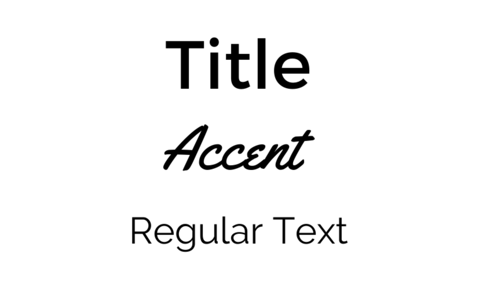
BRAND FONTS
Fonts are also very important when it comes to your brand. You’ll probably want 3 – one title font, one accent font, and one regular font for blocks of text. I am thinking I want a simple, block-style font for my title font so it’s easy to read. Then, for my accent font I might do something more fun, like a cursive font. I think this goes well with a cupcake brand. Then, I’ll choose something simple and easy to read as my regular font. This isn’t rocket science. You want fonts that look good together and are easy to read. You’ll also want to think about your brand – are you fun, funky, serious, modern? All of this can be conveyed through your font choices.
Here are the fonts I pulled together really quickly. I do most of my simple design work in Canva, so I chose fonts already available there. You can always find fonts on a font website, like www.dafont.com, but you’ll need to make sure they are available for commercial use before you utilize them in your branding.
LOGO AND FAVICON
A logo is a simple design, usually, with your company name, that is unique enough that others will start to associate it with your brand. Picture Google’s iconic multi-colored name, or the little blue bird belonging to Twitter. These are visual cues that immediately signal our brains that we’re talking about a specific brand.
As a general rule, I think it’s good to have two versions of your logo: one that is more of a square in shape and another that is more of a horizontal rectangle.
You can always pay a graphic designer to create a logo for you. Companies like www.fivver.com have great options for logo design at a low price. I’m going to use Canva to make my design. I mentioned it already, but Canva is a free online design tool that we use all the time at Red 11 Media. They even have some logo design templates you can start with.
I created three images: a square logo, a horizontal logo, and a favicon. It probably took me about 5 minutes using a template as my starting point. Here’s what I ended up with:


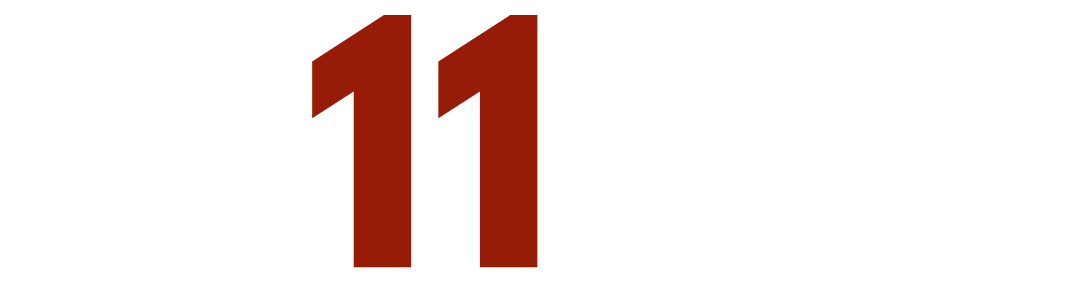
Now, some of you are wondering what a Favicon is. It’s the little square image that appears in the corner of the internet tab. For Red 11 Media, it’s a black square with a red “11” inside. Do you see it? It’s important to create and use one of these on your website, otherwise it ends up looking less professional. Because the square is so small, it’s important you don’t try to squeeze your whole logo in – something simple is better. For Kayla’s Cupcake’s I’m just using the cupcake from the logo. Easy!
Branding can be a real headache to finalize, because there are so many decisions and some of them you may have to live with for a long time. However, when you’re just starting out, our advice is to keep it simple. Don’t choose anything too crazy. Eventually you can re-brand or add colors or fonts, but for now here’s a one-page brand kit that will help make Kayla’s Cupcakes one killer website. I’d say it took me about 15 minutes total. If it were a real company of mine, I’d probably give it a little more time and thought and run it by some friends and family before finalizing everything.


Let us know what you think of this brand kit, if you need help building a brand kit of your own, or if you have any other questions. We’re here to help!
Kayla
Frequently Asked Questions
-
A brand kit is a simple document containing your visual brand elements: colours, fonts, and logo. It keeps your website, social media, business cards, and marketing materials consistent so customers recognise your brand instantly. Small businesses don't need a 100-page corporate guide. A single page covering the essentials saves time and prevents design headaches later.
-
Most small business brand kits include between two and five colours. Choose one or two primary colours that define your brand, then add a few complementary shades for accents, backgrounds, and call-to-action elements. Tools like Adobe Color help you generate balanced palettes automatically. Avoid using too many colours, as this dilutes brand recognition over time.
-
Three fonts work well for most small businesses: a title font for headers, an accent font for emphasis or decorative use, and a body font for paragraphs and longer text. Make sure your fonts pair visually and remain readable at different sizes. If you download fonts from sites like DaFont, always verify commercial licensing rights.
-
A favicon is the small square icon displayed in browser tabs next to your website name. It's typically 16x16 or 32x32 pixels, so simplicity matters more than detail. A favicon makes your site look polished and helps users identify your tab among many open windows. Skipping it makes your website look incomplete or unprofessional to visitors.
-
You can absolutely create a basic brand kit yourself using free tools like Canva and Adobe Color. For most small businesses just starting out, a DIY approach takes 15–30 minutes and works perfectly well. Hiring a designer through platforms like Fiverr is worth considering for logos or if you want a more polished, professional finish from the start.